Certificate Calligraphy Tips
Jun 14, 2023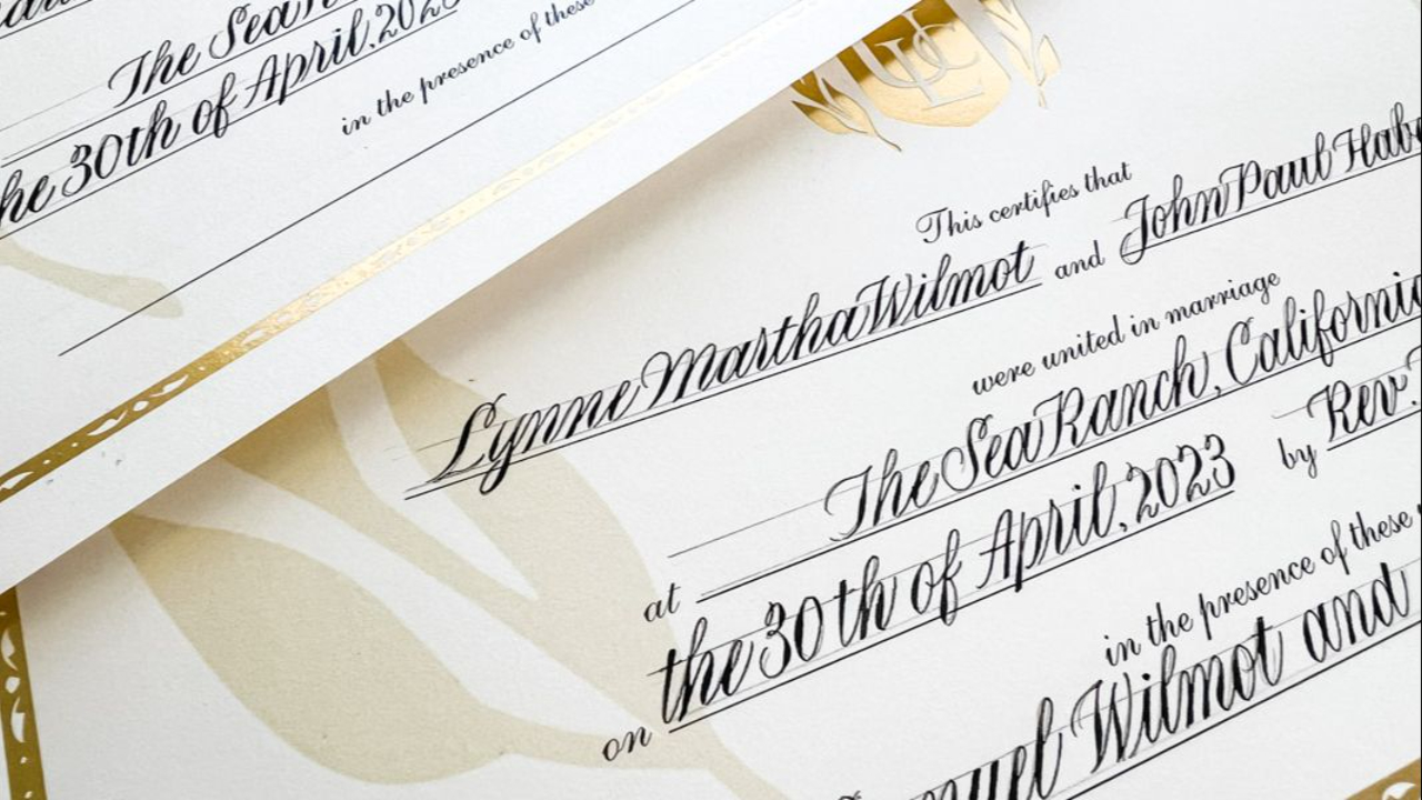
Over the years of being asked to fill out wedding and stockholder and recognition certificates with pretty calligraphy, I've modified my approach a little. Nothing ground-breaking or earth-shattering, but little things that I think make a difference both in the final aesthetic and in my own work ease.
1. Prep the certificate fist. You never know how well the certificate will take ink and the last thing you want is messy looking feathering. I use hair spray (works like art fixative but it's cheaper and easier to get). Just spray a light, even coat using an aerosol can then let it dry completely. This seals the paper and helps prevent feathering and fiber lifting. I haven't found the brand matters but it does matter that it's an aerosol can for a nice even application. I like to get the travel size cans from the grocery or drug store because they fit nicely in my desk drawer.
2. Pencil in a baseline just above the printed line on the certificate. It looks cleaner and more professional when the calligraphy does not touch the printed line. I didn't used to do this. Notice on this stockholder certificate, the writing is sitting on the baseline. 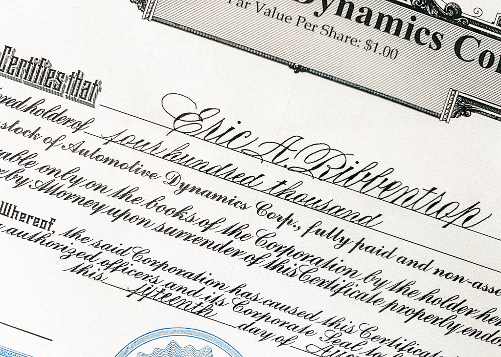
Nothing wrong with that, I just personally think it looks nicer when it's floating. Compare that to how I do it now without touching the printed line on the certificate with my calligraphy.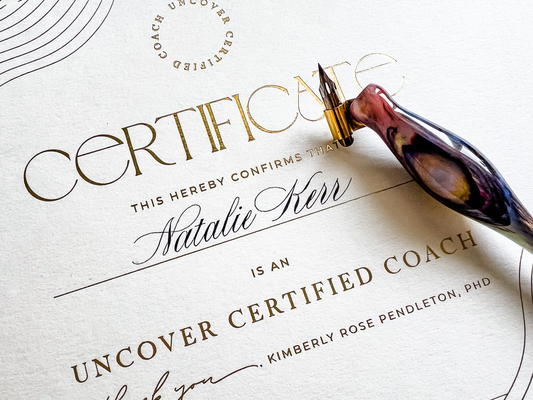
3. Pencil all the text first to ensure that each element fits and is perfectly centered. Sometimes you have lots of room to add some flourishing. If so, I still keep it rather simple. And sometimes, you really have to cram the writing in. In those cases, I write with an extra narrow script by condensing my letterforms (like on the Lynne and John certificate below).
4. Use a script that matches/combines well with the printing on the certificate. (i.e. Modern would look dumb on this wedding certificate because the printed script on the certificate itself is a traditional Copperplate.)
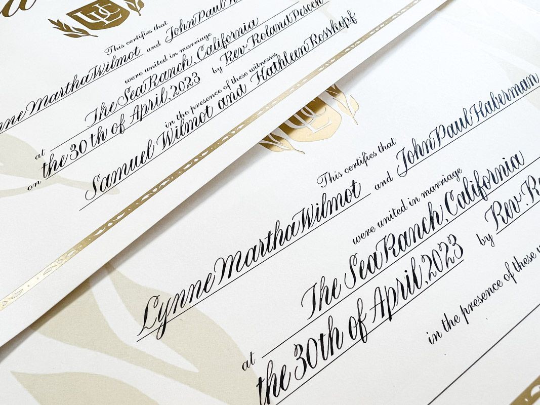
5. Double check your spelling and then double check it again before you ink anything. When we know what a word is supposed to say, often our brains won't see that we've left a letter out or spelled a name differently than the way the person spells it. I've even left a letter out of my husband's name before! LOL. So, if you are anything like me, you really have to proof with intention.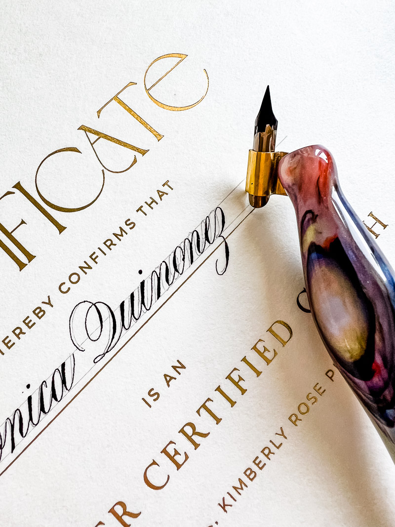
6. Don’t try to trace the pencil draft perfectly. Use it as a spelling and spacing guide but let the calligraphy flow more naturally out of your hand. Tracing will look stiff. Some of you may also note my high connective strokes on that ssk of Rosskopf. That saved space and I liked the look. 
Also, in the entry oval of this L, when I inked, my oval was flowing out of my hand better higher up. Go with the flow even if it doesn't match your pencil draft perfectly. Remember, it's a guide, not a mandate.
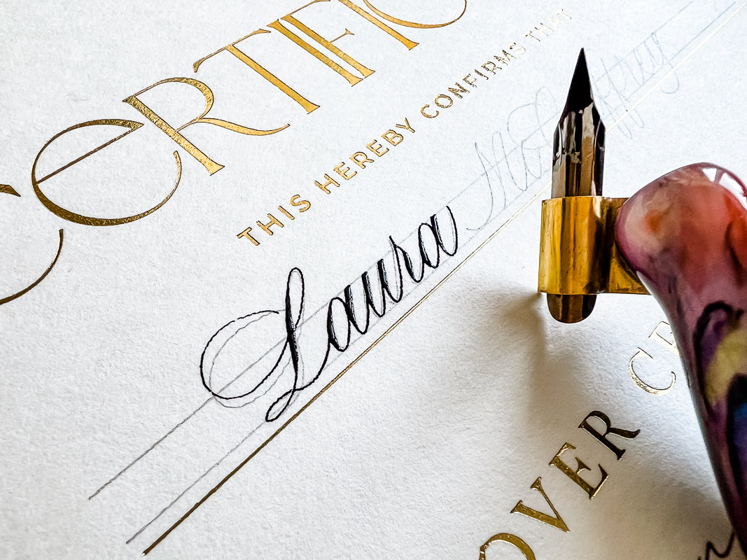
7. When you think it’s safe to erase, wait another hour or two or three‼️ (I normally just leave it until the next day to ensure I’m not impatient.) My favorite erasers are the Generals kneaded eraser* and the Pentel white polymer erasers*. Both are gentle on the paper. My favorite pencil is my Pentel GraphGear 1000 in a .3 lead*. I am also very careful to use a light hand with the pencil. I don't press down. If you press, it will leave an indent in the paper even after you erase all the graphite.
8. Use an archival ink such as gouache or Speedball Super Black* (which has the added benefit of being waterproof… although I don’t expect a certificate to get wet.) My favorite brands of gouache are Holbein* or Windsor and Newton*.
9. Remember to feel completely honored that you are now forever part of this couple’s love story or a person's accomplishment even if you were hired by the officiant or the boss and they have no idea who you are. ♥️
Check out Copperplate and lots of other fabulous classes on learncalligraphy.com
* As an Amazon Associate, I may earn a small commission from qualifying purchases.


